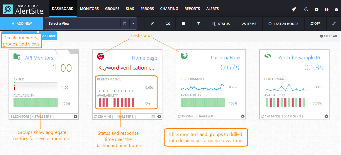
AlertSite Dashboard is the default home page for logged in users and is also accessible via the top menu.
The dashboard shows the status of all your monitors and lets you create new ones. Here you can see whether monitors have found any problems on your monitored websites over the selected period (12 hours, 24 hours, 7 days, or 30 days). If a monitor finds an error, its tile moves to the top of the dashboard and appears with a red icon.
The dashboard automatically refreshes for the latest status updates. You can pause and resume auto-refresh by clicking .
Create monitors and monitor groups
Hover over + Add New, then click Monitor to create a new monitor, or Group to combine several monitors into a group to track their performance as a whole. For more information, see:
| Note: | You must be an Admin, Co-Admin, or Power User to create monitors. |
Dashboard data
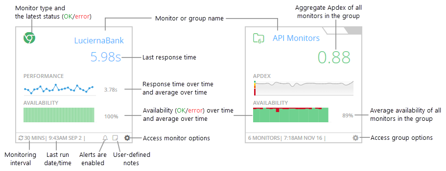
The dashboard shows various metrics for individual monitors and monitor groups. Groups show aggregate metrics for all monitors in the group.
The main metrics are:
-
Availability – the test status (success or error). For multi-step monitors, a successful test means all steps completed successfully.
-
Performance – your website response time. For multi-step monitors, this is the total response time of all test steps.
Note: Only successful runs (status 0) are included in response time calculations. -
Apdex (in group tiles only) – Application Performance Index, a value from 0 to 1 that estimates user satisfaction with the application’s response time. 1.00 is perfect, less than 0.50 is bad, and 0.00 means all users are frustrated.
Monitor and group actions
Click on a dashboard tile or row to open a menu with monitor-specific or group-specific commands.
| Command | Description |
|---|---|
| Quick View | Open the diagnostic viewer to drill into charts and run results without leaving the dashboard. |
| View Monitor/Group Details | View monitor summary or group summary. |
| Test on Demand | Run a test on demand. Resuts are displayed on the screen. |
| Share Monitor/Group Tile | Get a public access link for this monitor tile. You can share this link with anyone or use it to embed the tile into external web pages. See Sharing and Embedding Dashboard Tiles. |
| Add/Edit Monitor Note * | Add or edit monitor notes. |
| Edit Configurations * | Open monitor settings or group settings. |
* Not available to read-only and report-only users.
Dashboard display options
Use the items on the dashboard toolbar to change the way the data is displayed.
You can:
-
Switch between the tile view and list view.
-
Switch between the Day (Light) and Night (Dark) themes.
Note: The theme applies to the entire AlertSite UXM interface. -
Expand the dashboard to hide all toolbars and navigation elements and display the monitoring results only.
-
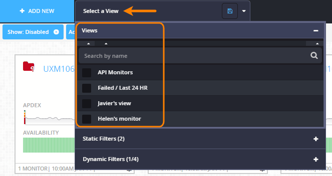
Filter the dashboard to only show the monitors, monitor groups and subaccounts you are interested in. Optionally, save your filter as a >view for later use. Saved filters appear under the Select a view menu in the dashboard header.
For details, see Filters and Views: Customize the Dashboard.
-
Sort the monitors by name, status (OK/error), response time, or other conditions. By default, they are sorted by status, descending – groups with errors, monitors with errors, OK groups, OK monitors.
-
Choose how many items to show on the dashboard: 25, 50, or 100.
-
Choose the time frame for the displayed data: last 12 hours, 24 hours, 7 days, or 30 days. (This applies to all AlertSite dashboards.)
-
Pause the auto-refresh by clicking the refresh timer so that it becomes OFF. Click it again to resume the auto-refresh.
Compare monitors
Click ![]() Compare on the dashboard toolbar to enter the comparison mode. Here, you can compare multiple monitors using a grid view or chart view. For details, see the following topics:
Compare on the dashboard toolbar to enter the comparison mode. Here, you can compare multiple monitors using a grid view or chart view. For details, see the following topics:
View monitor status by location or steps
You can also view the status of individual monitors by locations and by steps. This way, you can quickly visualize the patterns and trends in your monitoring results:
-
See the results from the last test from each location.
-
See how the response time varies between steps and locations.
-
Identify the steps that generate errors.
-
Determine if an error is only occurring from one location and how often.
-
Understand if errors are sporadic or a function of either the location or time, or both.
To do these:
-
On the Dashboard, click on a monitor tile and select
 Compare Monitors.
 -
Under Actions, click
 to expand the monitor’s locations, and click to expand the steps.
Drill into details
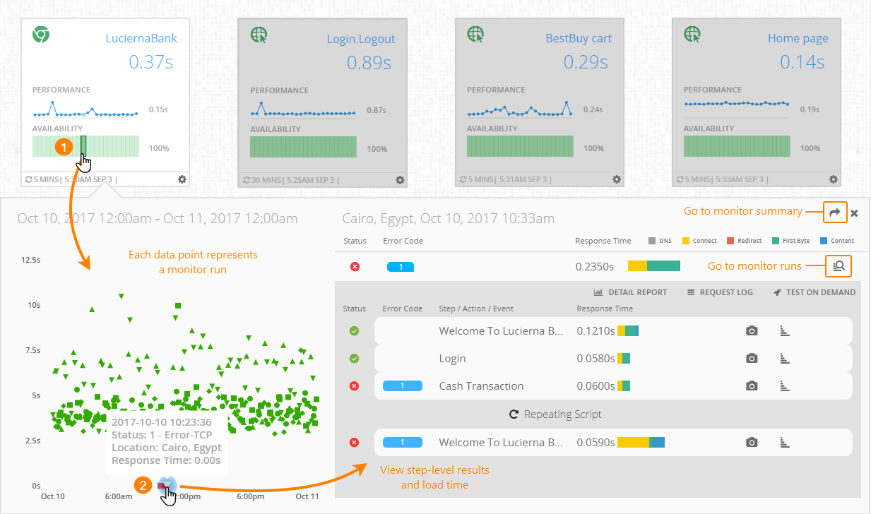
You can drill into the monitor run results without leaving the dashboard. To do that, click a time segment on a chart or select Quick View from the monitor options menu (). This opens the diagnostic viewer with the run results for that period (hour or day). Here, you can do the following:
-
View all runs for the selected time segment.
-
View step-level details and response time breakdown.
-
See exactly which step failed (in a multi-step monitor).
By default, the viewer shows the most recent failed run in the selected time segment, or the most recent run if there are no failures. You can change the displayed run by selecting another run on the scatter plot.
The diagnostic viewer contains two parts:
-
Scatter plot (on the left) – Shows all monitor runs over the selected time segment. The Y-axis is the monitor response time, and the dot color indicates the test status (OK or error). Clicking a dot will show the run results on the right.
-
Run results (on the right) – This includes the step-level results, response times broken down into color-coded components, waterfall charts, and other details. This is the same data you can see on the Monitor Runs dashboard, excluding the event-level details. For the event details, you can click
 to navigate to the Monitor Runs dashboard.
In this way, by using the diagnostic viewer, you can quickly get the information needed to troubleshoot “red” statuses or high response times without having to navigate away from the dashboard.
List view columns
You can switch from the tile view to the list view by clicking on the dashboard toolbar. In the list view, you compare the monitor metrics side by side.
The list view contains the following columns:
| Column | Description |
|---|---|
|
Details |
– Expand the steps of a multi-step monitor.
CV – Expand the ContentViews of a DéjàClick monitor (if the monitor has ContentViews). |
| Status |
For monitors – the last status (success or error) reported for a monitor, step, or location. For groups – the current Apdex rating: Excellent, Good, Fair, Poor, Bad. |
| Name | The name of the monitor or group. |
| Type | The icon indicates the monitor type or the number of monitors in a group. |
| Performance | Response time over time (for monitors) or Apdex over time (for groups). Hover over the points on the chart to see the exact values. |
| LRT | The response time during the latest test (for monitors only). |
| Availability | Percentage of successful tests (status 0) over time. Hover over the chart to see the exact values. |
| Duration | Time since the last error. |
| Errors | The number of errors reported during the dashboard time frame. |
| Last Run | The date and time of the latest run of the monitor or the group’s monitors. |
| Interval | How often the monitor runs. |
|
Other icons |
– Monitor has one-time blackouts configured. – Monitor has recurring blackouts configured. – Alerts are enabled for the monitor. – View the monitor note. – Options menu. (Not available in the Compare mode.) |
See Also
Editing Monitors
Monitor Groups
Changing Dashboard Logo
AlertSite Dashboards


 Creating Monitors


