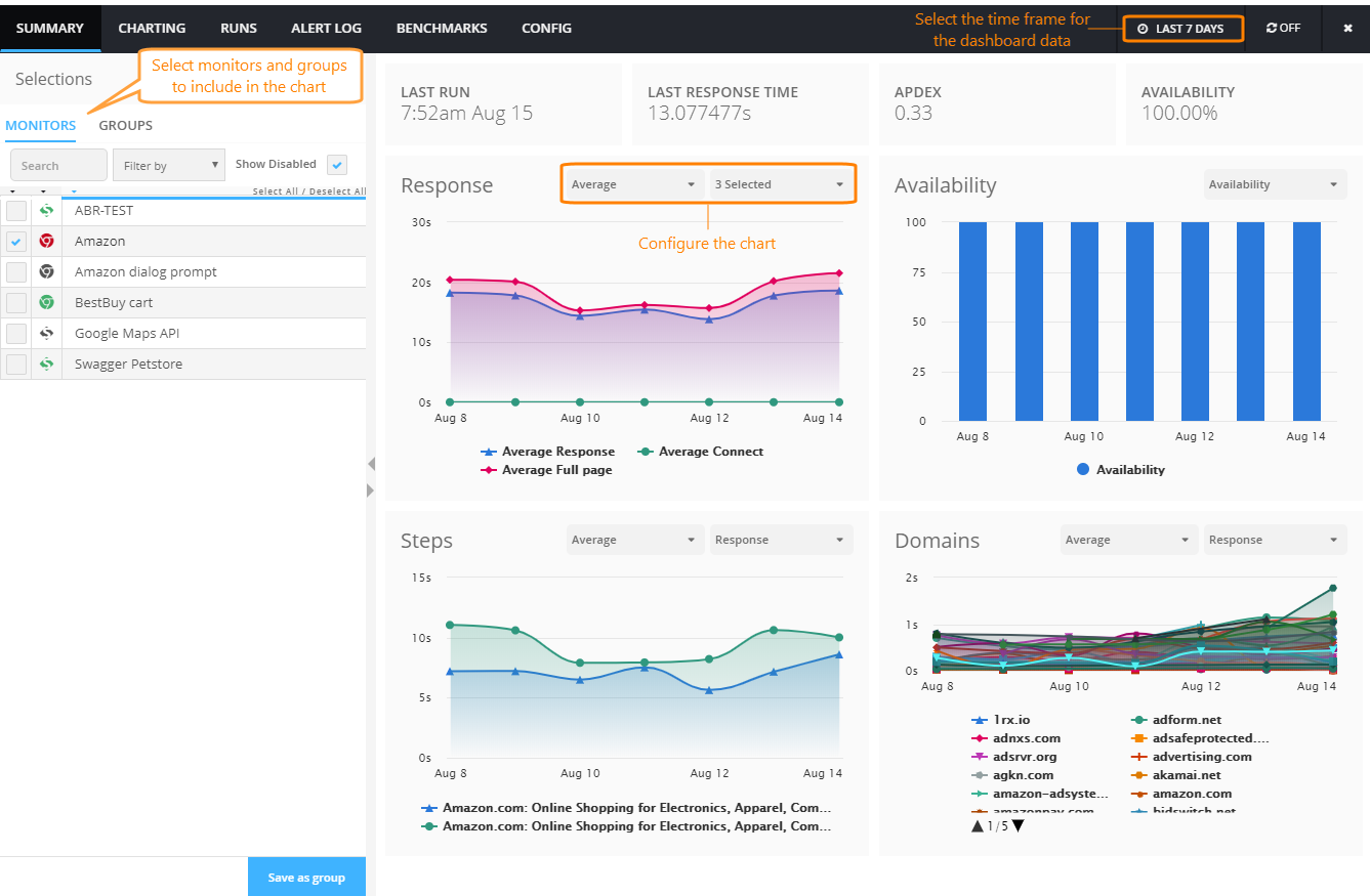
The Summary dashboard in AlertSite UXM shows your website availability and performance data collected by your AlertSite monitors during the specified time period.
The dashboard shows:
-
The date and time of the latest run of the monitor or of the group's monitors.
-
The last response time (the full page response time, if available. Otherwise, the base response time).
-
The Apdex rating over time.
-
The Google Analytics metrics.
-
The percentage of successful tests (status 0) over time.
-
Charts with various metrics collected by your AlertSite monitors during the selected time period.
Open the dashboard
-
Go to Monitors > Overview.
-
Switch to the Summary tab.
-
In the list on the left, select the monitors and groups to view the summary of.
Note: Selecting a group will replace the previous selection with the monitors from that group. To combine a group with other monitors, select the group first.
Charts
Response
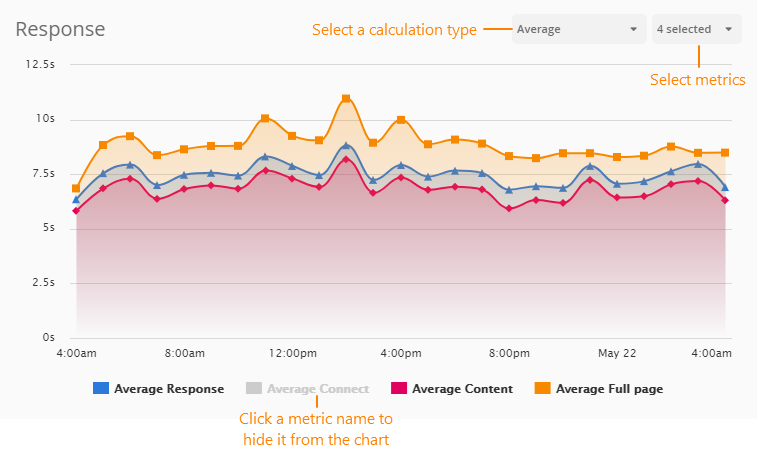
The Response chart shows response time components collected by the selected monitor. You can select multiple metrics for easy comparison and apply calculation to them, for example, the average response time or the maximum first byte time.
Availability
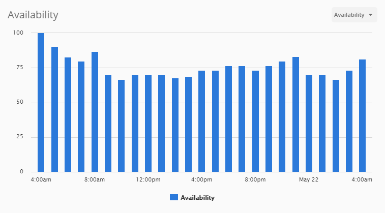
The Availability chart shows your website average availability over the selected time period. Availability means the monitor run completed successfully, and the run returned a status of 0. A successful run means the monitored website is reachable, returns the expected results, and does not have errors.
The chart has two metrics:
-
Availability – Shows the website availability over the selected period as a percentage of successful tests. Each bar represents the average availability per the corresponding period (hour or day).
-
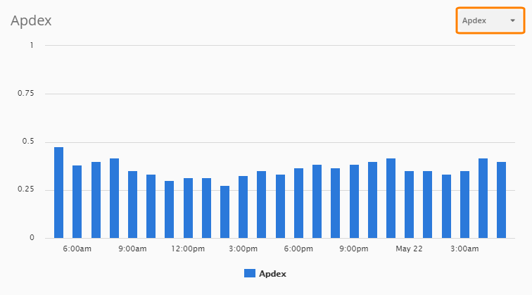
Apdex – Shows Application Performance Index , a value from 0 to 1 that estimated user satisfaction with the application response time. 1.00 is perfect, less than 0.50 is bad, and 0.00 means all the users are frustrated.
Steps
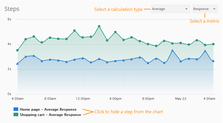
The Steps chart shows response time components by steps for multi-step monitors. You can also apply calculation to the metrics, for example, to show the average response time or the maximum first byte time.
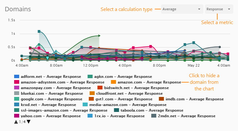
Domains
Interact with charts
View details for a data point
Hover over the chart points to see a tooltip with the status at that point, including:
-
Monitor name
-
Metric name
-
Metric value
-
Test date and time
The exact information depends on the chart type and configuration.
Filter the charts
Click a metric, step, or domain name under the chart to hide or show the results in the chart.

