AlertSite provides an easy-to-use charting interface to visualize your monitoring data. Response time, availability, and Apdex information collected by your AlertSite monitors can be presented in a customizable chart. Charts can display multiple series of data for easy comparison. You can customize the level of granularity – for example, display raw data or hourly averages.
The charting interface is accessible via the Charting link in the AlertSite header and via Monitors > Overview > Charting.
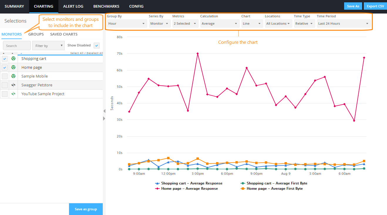
Use the sidebar on the left to select the monitors and monitor groups to include in the chart.
| Note: | Selecting a group will replace the previous selection with the monitors from that group. To combine a group with other monitors, select the group first. |
Default chart
By default, the chart shows the average response time of the selected monitors over the last 24 hours. You can change the displayed metrics by using the Metrics list above the chart.
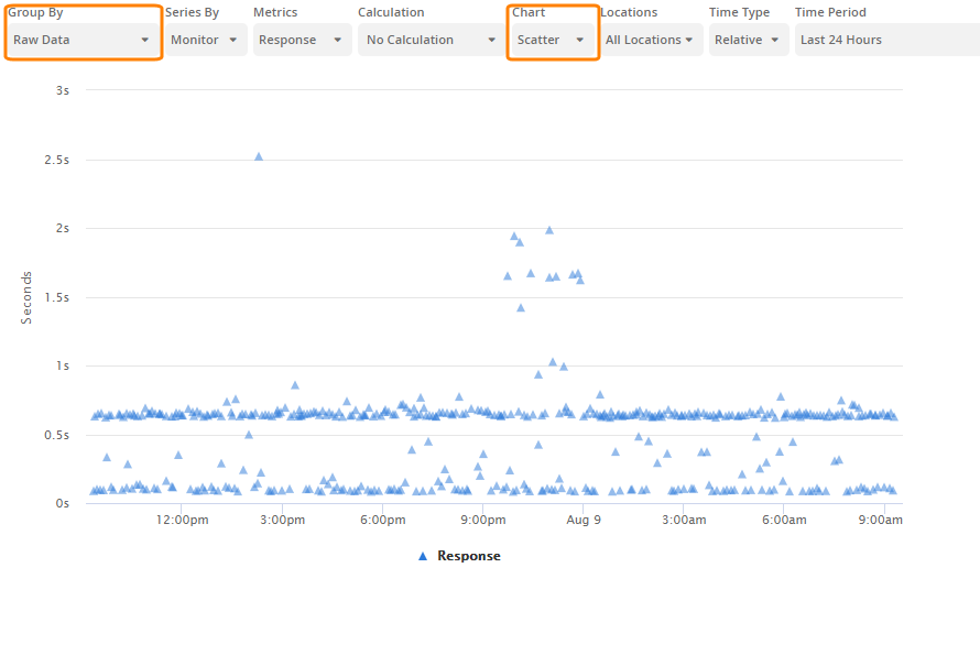
| Note: | Most chart types show only successful tests (with status 0). To view all test results, use a Scatter chart with Group By: Raw Data. |
Chart options
The following options can be changed using the toolbar above the chart.
This option lets you switch between raw data and grouped (summary) data.
You can group a chart by:
-
Monitor, location, or monitor group
-
Time (raw data, hour, day, week, month)
Raw data means each data point represents a single monitor run. When used together with Chart: Scatter, raw data helps you get a quick overview of all monitor runs over the selected period.
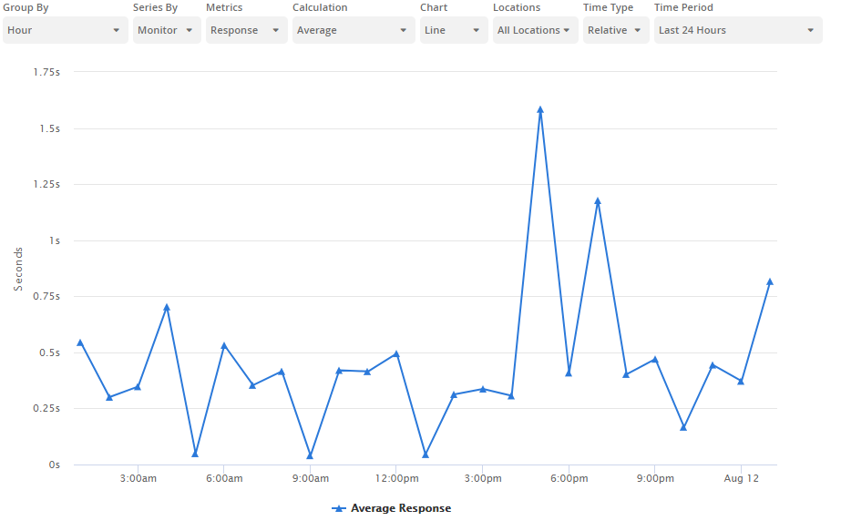
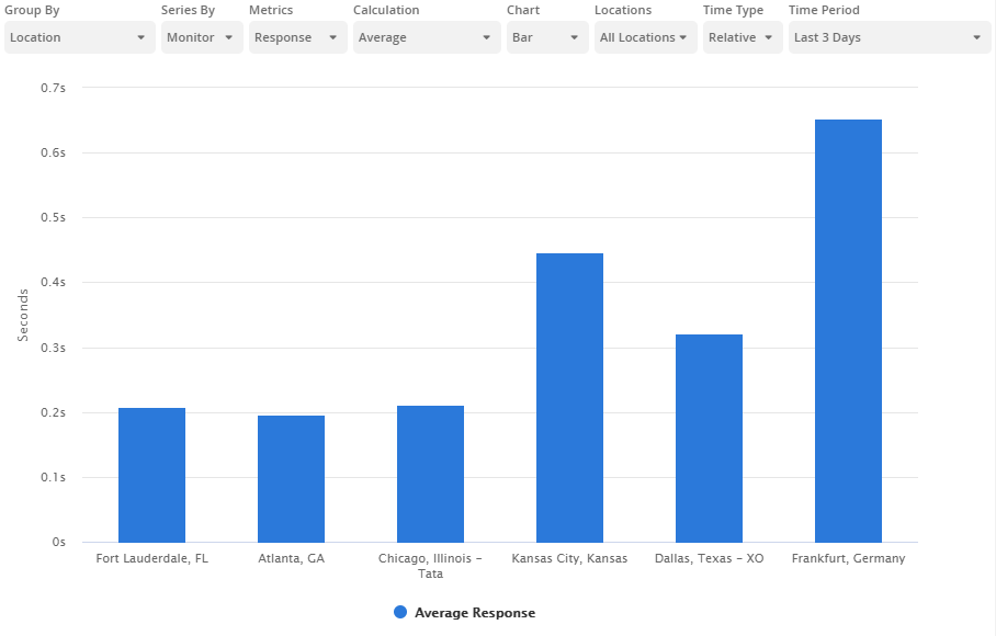
With large data sets, you may want a quick aggregated view of the data. That is what the grouping options are for. When grouping is used, the X-axis is split into intervals based on the selected unit of measure, and the data points on the chart are the average values for each interval. Data can be aggregated by various classifications, such as Time, Week, Locations, Monitors, and so on.
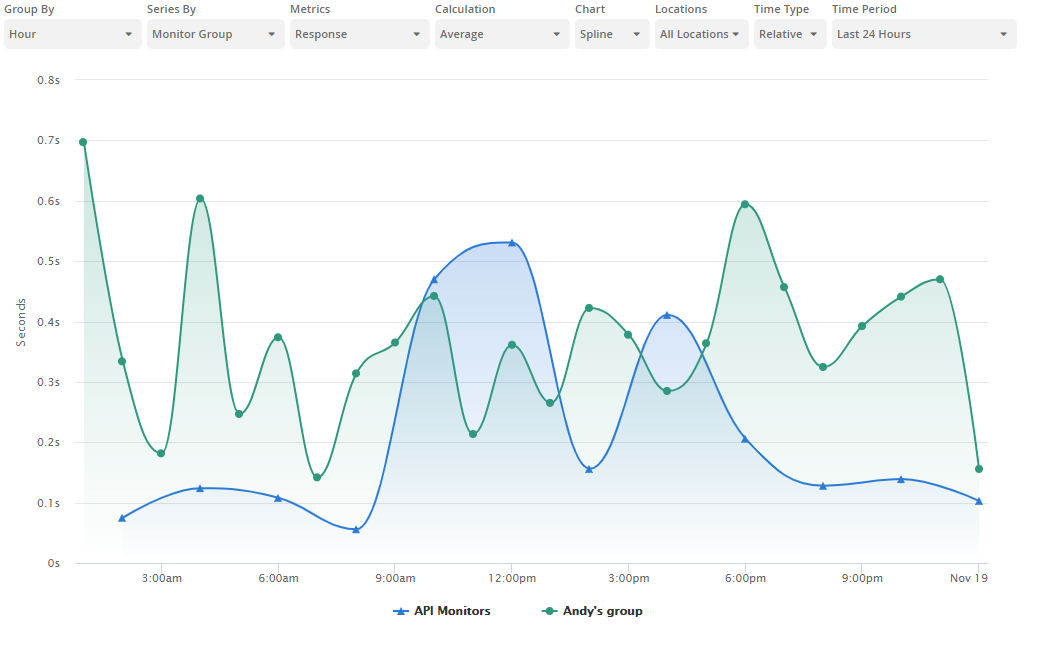
For example, a chart grouped by Hour shows hourly averages:
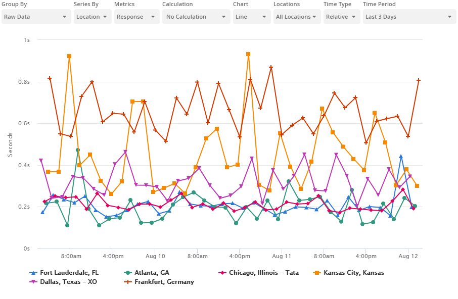
Similarly, a chart grouped by location shows the average values for each location:
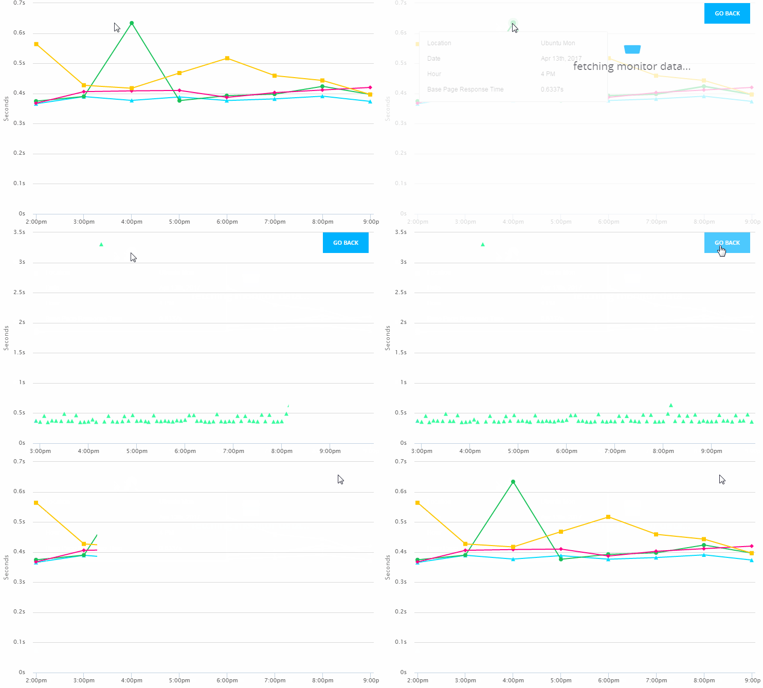
Grouped charts have drilldown capabilities – you can click a data point or a bar to view the underlying raw data.
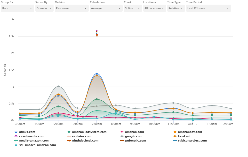
A series corresponds to an individual line on a line chart, or same-colored bars on a bar chart. Each series represents a distinct data set, such as the values of a specific metric of a monitor, or the metric values measured from a specific location. Series can be assigned a unique color or data point shape to make the chart easier to understand. The series legend appears under the chart.
Possible series depend on other chart configuration. You can choose between:
-
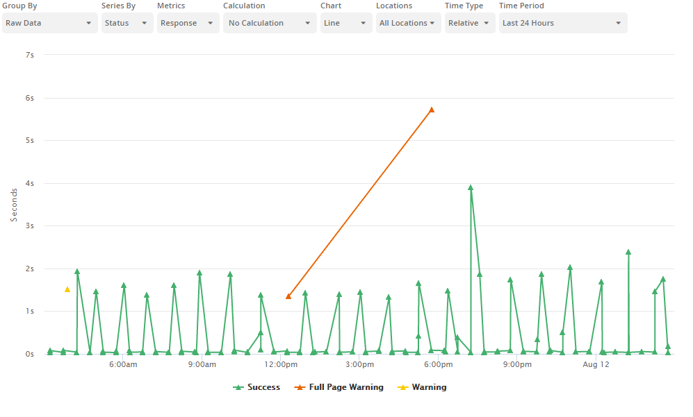
Status – Shows the response time status: Success, Full Page Warning, Warning, or Error.
-
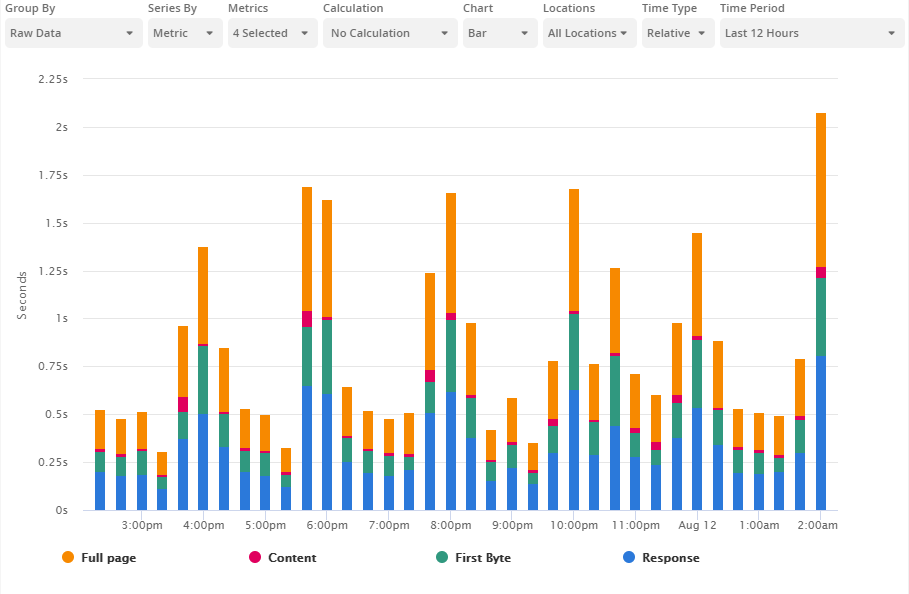
Metric – Shows the response time broken into individual network timings.
-
Location – Shows the response time by location.
-
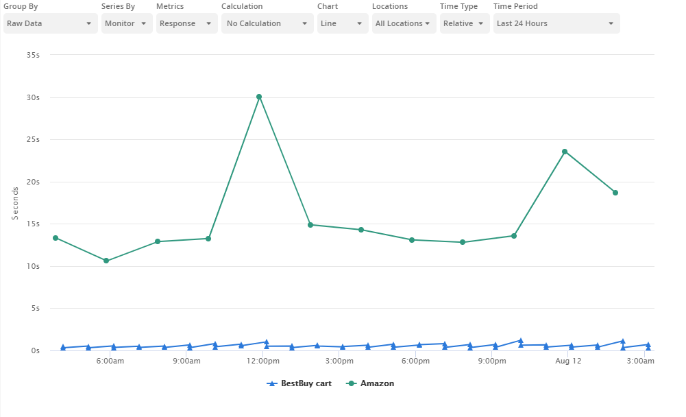
Monitor – Shows the response time by monitor.
-
Step – Shows the response time by steps.
-
Domain – Shows the response time by domain.
-
Monitor Group – Shows the response time by monitor groups.
-
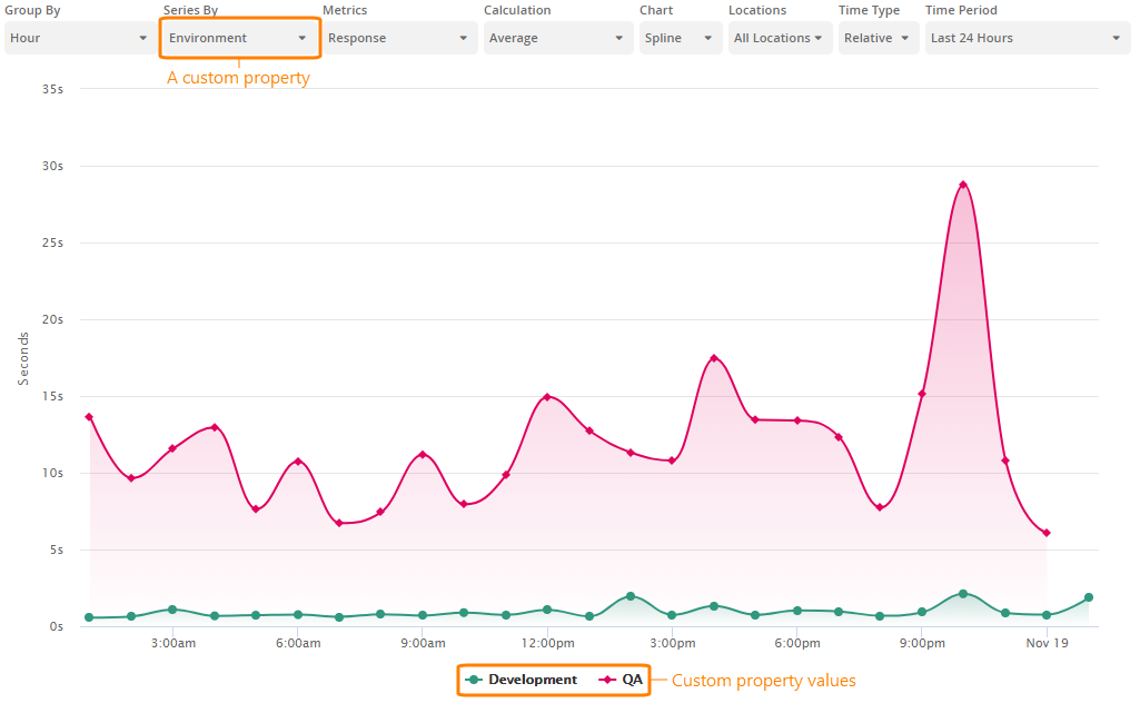
Custom Property – Shows the response time by a custom property.
Metrics
Select one or more metrics to show in the chart. Available metrics include:
-
Availability (percentage of successful tests)
-
Google Analytics metrics (if Google Analytics integration is configured)
| Note: | Some metrics may be not available depending on the chart type. |
Calculation
Indicates what values to show in the chart: Average, Median, Mode, Min, Max, Standard Deviation, Sum, or do not apply calculation and show actual values.
The chart type – Line (default), Bar, Spline, or Scatter.
Select the locations whose data you wish to include in the chart. Select none to use data of all locations.
Time Type, Time Period (relative), or Time Range (absolute)
The time range for the chart. You can select a relative time range, such as Last 24 Hours or This Week, or an exact date range within your data retention period (which is 3 months by default).
Export to CSV
You can export the current chart’s data to CSV. To do this, click Export CSV in the top right corner of the chart. The CSV data includes:
- Monitor name and type.
- Location (for raw data charts or grouped by locations).
- Date and time of monitor run (for raw data charts).
- Response time and its breakdown into network timings (DNS time, connect time, redirect time, first byte time, content).
Save and load charts
You can save and load chart configuration for future use. A saved chart stores information about the selected monitors and chart options (chart time, date range, and so on).
Save a chart
-
Click Save As on the toolbar above the chart.
-
Enter a name for this chart and click Save.
All saved charts are listed on the Saved Charts tab in the left sidebar.
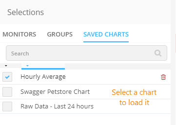
Load a chart
Select a chart in Saved Charts. The displayed chart will be updated immediately.
Edit a chart
-
Select a chart in Saved Charts.
-
Change the chart options and selected monitors as required.
-
Click Save on the toolbar above the chart, and confirm the change.
Delete a chart
Select a chart in Saved Charts, then click next to the chart name.
Interact with charts
View details for a data point
Hover over the chart points to see a tooltip with the status at that point, including:
- Monitor name
- Location
- Test date, time, and status (0 – success)
- Response time with breakdown into where the time was spent (see Web Page Load Time for the description of the metrics)
- Full page response time (only for website and DéjàClick monitors with the fullpage monitoring enabled)
- Website availability (only for grouped charts)
- HTTP status code
The exact displayed information depends on the chart type and configuration.
When using grouped charts, click a summary data point or a bar to view the raw data for the corresponding interval. Raw data appears as a scatter plot, where each data point represents a monitor run. Click Go Back to return to the main chart.
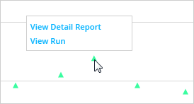
In raw scatter plots, click a data point for a tooltip with the View Run and View Detail Report links. View Run opens the run results on the Monitor Runs screen. View Detail Report displays the run data in a tabular, printable format as the Detail report.
Zoom the chart
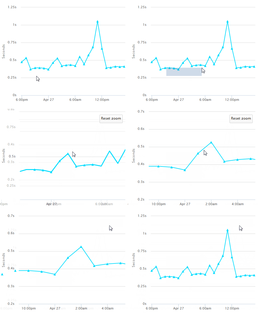
Drag on the area you want to zoom into. To return to the original chart, click Reset zoom.

 View image