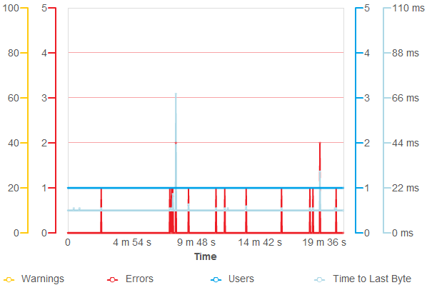
On the Custom Charts page of the Report panel, you can create custom charts and select predefined graphs to show.
Using custom charts, you can easily compare several metrics in the same chart.
Viewing the Page
To view custom charts:
-
Open the desired test log item. To do this, right-click the item's name in the Project_Name Logs folder in the Project Explorer and then click Open.
-
In the Report panel, switch to the Custom Charts tabbed page.
Requirements
To view the graphs and charts shown in the Report panel, install Flash Player 8 or later for Windows Internet Explorer on your computer. You can download the latest version of the player from the Adobe web site:
Common Operations
To add a new custom chart
-
Click
 New Chart at the top of the page.
 -
Switch to the Options tab of the created graph.
-
Find the metric you want to add to the chart and move its toggle to the right or to the left. The chart will show the metric’s axis on the right or on the left correspondingly.
-
Switch to the Chart tabbed page to see the created chart.
To modify an existing custom chart
-
Switch to the Options tab of the desired graph.
-
To hide a metric, move its toggle to the middle position.
-
To add a metric to the chart, move its toggle to the right or to the left. The chart will show the metric’s axis on the right or on the left correspondingly.
-
Switch to the Chart tabbed page to see the updated chart.
To delete a custom chart
Click  Close Chart on the right of the chart to delete.
Exporting and Printing the Custom Charts Page Contents
Before you export a report with custom charts and data tables to a .pdf file or print it, open the Custom Charts page so that LoadComplete can generate them. Otherwise, no charts or data tables will be generated, and LoadComplete will not be able to export or print them.
Tabs Description
The Custom Charts page has several tabbed pages:
These tabs show a custom chart in different modes. The next sections of this topic describe the tabbed pages of the Custom Charts page.
At the top of the Custom Chart page’s tab there is the  New Chart button. Click the button to add a new chart to the page.
To customize the chart, use the Options tab (see below).
The Chart Page
The Chart page shows the selected metrics in a chart. A sample view of the chart is as follows:

Most graphs show both the average and the maximum values of a metric: the thick line represents the average values, the thin line represents the maximum values. If the average and maximum values are equal, the graph shows only the average values.
To customize the graph:
-
Switch to the Options tab that corresponds to the desired graph.
-
Move the toggles of the metrics you want to hide to the middle position.
-
Move the toggles of the metrics you want to add to the custom chart to the right or to the left. If you move a toggle to the right, the custom chart will show the appropriate metric axis on the right. Otherwise, it will show the axis on the left.
-
Switch to the Chart page to see the updated chart.
You can also filter the graph lines. To hide a line, click the line name in the graph legend. To show the hidden line, click its name in the legend again.
The Scroll Chart Page
This section shows a scroll chart for any metric selected for the custom chart on its Options page. You can zoom these graphs in and out. You can also select the desired area of the graph and then overlay it with another area. For more information on working with scroll graphs, see Working With Scroll Graphs.
The Data Table Page
This page contains a table that represents the data shown on the Chart page in a tabular form. For a detailed description of its columns, refer to the description of the graphs shown on the custom chart.
The Options Page
The Options page lists the metrics you can add to your custom chart. All the available metrics are organized into tables:
-
The first column contains toggles that specify what metrics the custom chart shows. The possible toggle positions are:
-
Left - Indicates that the custom chart shows the selected metric on the left.
-
Middle - Indicates that the custom chart does not show the selected metric.
-
Right - Indicates that the custom chart shows the selected metric on the right.
-
-
The second column lists all the available runtime metrics. You can view the same metrics on the Graph page.
The second column of the Scenario Completion Time table shows a list of scenarios of your load test. You can also view the scenario completion time metrics on the Scenario Completion page of the Report panel.
The second column of the Transaction Completion Time table shows a list of user-defined transactions of your load test. You can also view the transaction completion time metrics on the Transaction Completion page of the Report panel.
See Also
About Test Results
Test Result Panels
Creating and Configuring Load Tests

 Viewing the Page