
Specifies the custom image to be used as the component’s foreground.
Declaration
| Read-Write Property | A TBitmap object |
| componentPropObj | One of the objects listed in the Applies To section |
Applies To
This property applies to the following objects:
Description
Use this property to read or get the custom image used to fill a bar of a TcxProgressBar component. The bar is only filled with the image when the BarStyle property is set to “cxbsBitmap” or “cxbsBitmapLEDs”. If the image is smaller than the component’s client area then it is tiled. If the image is larger than the component’s client area then it is cropped.
When the BarStyle is “cxbsBitmap” the area where the image is displayed indicates the progress position: 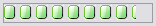
When the BarStyle is “cxbsBitmapLEDs” the image area is additionally divided into rectangles: 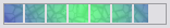
| Note: | If ForegroundImage does not hold an image (that is, the ForegroundImage property cell on the Properties page of the User Forms editor displays the “None” value) and the style is “cxbsBitmap” (or “cxbsBitmapLEDs”) , then the progress bar does not indicate the progress state. |
The color of the lower left pixel can be treated as a transparent color. If the TransparentImage property is set to True, then the image pixel with the same color as the lower left pixel will appear transparent.
Property Value
A TBitmap object that contains the desired image.
To specify an image at design-time, open the Properties page of the User Forms editor and press the ellipsis button within the ForegroundImage property value cell. Use the ensuing Image Editor to view the image, load new images or save the current image to a file.