
Specifies the appearance of the progress bar.
Declaration
componentPropObj.BarStyle
| Read-Write Property | String |
| componentPropObj | One of the objects listed in the Applies To section |
Applies To
This property applies to the following objects:
Description
The TcxProgressBar component can be displayed in different ways. Use the BarStyle property to get or set the style of the progress bar.
Property Value
One of the following string values:
| Value | Appearance | Description |
|---|---|---|
“cxbsAnimation” |
 |
A Windows Vista progress bar style. The bar color is specified with the BeginColor property. The style includes animated highlighting which moves across the progress bar. Highlighting movement settings can be specified with the AnimationPath, AnimationRestartDelay and AnimationSpeed properties. This progress bar style does not support the OverloadBar and Peak Value features. |
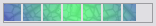
“cxbsAnimationLEDs” |
 |
A Windows Vista progress bar style. The bar is divided into rectangles and colored with the BeginColor color. The style includes animated highlighting which moves across the progress bar. Highlighting movement settings can by specified with the AnimationPath, AnimationRestartDelay and AnimationSpeed properties. This progress bar style does not support the OverloadBar and Peak Value features. |
“cxbsSolid” |
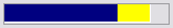 |
The bar is filled with BeginColor. The overload bar (if visible) is filled with OverloadBeginColor. |
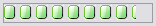
“cxbsLEDs” |
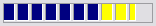 |
The bar is divided by rectangles and filled with BeginColor. The overload bar (if visible) is filled with OverloadBeginColor. |
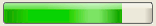
“cxbsGradient” |
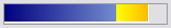 |
The bar is painted with gradient fill from BeginColor to EndColor. The overload bar (if visible) is painted with gradient fill from OverloadBeginColor to OverloadEndColor. |
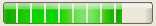
“cxbsGradientLEDs” |
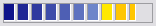 |
The bar is divided by rectangles and painted with gradient fill from BeginColor to EndColor. The overload bar (if visible) is painted with gradient fill from OverloadBeginColor to OverloadEndColor. |
“cxbsBitmap” |
 |
The bar is filled with a custom image. The image file is specified by the ForegroundImage property. If the specified image is smaller than the control’s client area, it is tiled. |
“cxbsBitmapLEDs” |
 |
The bar is divided by rectangles and filled with a custom image. The image file is specified by the ForegroundImage property. If the specified image is smaller than the control’s client area, it is tiled. |