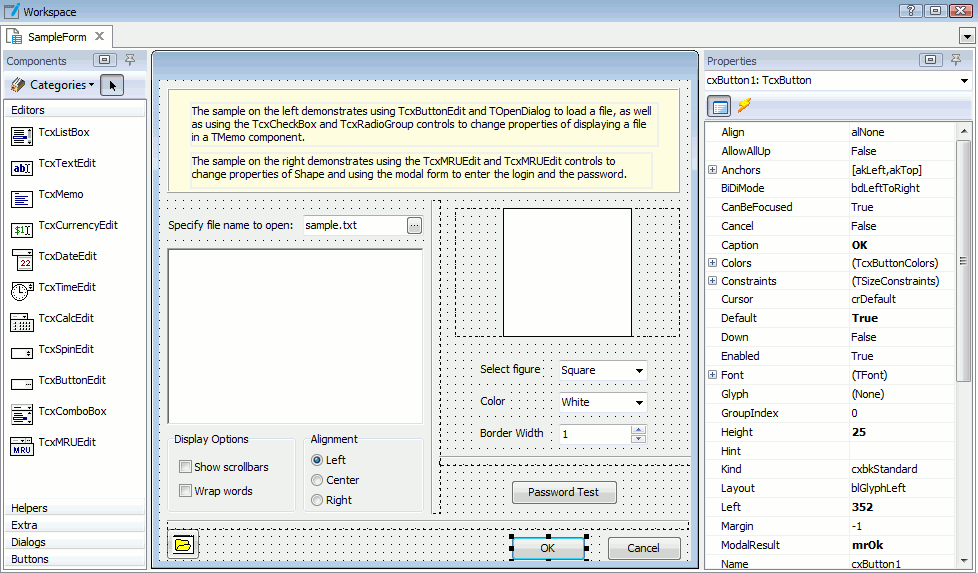
The editor area is divided into several parts:
-
The form with the sizing grid is displayed in the center area. The grid step is specified by the Grid step option and is 8 pixels by default.
-
All available components that you can use in your forms are listed in the Components pane (by default, it is situated on the left of the editor). If the Components pane is not visible, right-click somewhere in the editor and select Show Components Palette from the context menu. The components are organized into several categories - Editors, Dialogs, and so on. You can switch from one category to another by clicking the category tab or selecting it in the Categories list on the top of the pane.
-
In the Properties pane (which is by default situated on the right of the editor), you can view properties and events of the component that is currently selected on the form. If the Properties pane is not visible, right-click somewhere in the editor and select Show Properties from the context menu. The Properties panel has two pages - Properties and Events. To display the corresponding page, use the  Properties or
  Events button in the top of the pane.
The list on the top of the Properties pane lists all form components. It displays the component name as well as the component class. You can use this list to quickly switch from one component to another without selecting the component on the form.
The Properties page lets you view and change the component properties. Each component has various properties that let you configure the component size, appearance, behavior and so on. If a component’s property is an object, the property value cell displays the object class in the parenthesis, for example, “(TcxButtonColors)”. If this object has child properties, you can view them by expanding the parent property’s node.
Almost all components can raise events. The list of events that occur in the component that is currently selected is displayed on the Events page. Here you can view and specify routines for handling events that occur in the form components. You can create new script routines for handling a particular event as well as specify the existing routine to handle the event. See Handling Events in User Forms.
Note that the layout of editor panels can be customized. You can move the editor panels to another location or temporarily hide panels. See Docking.
 To add a new component to the form
To add a new component to the form To add a new component to the form
To add a new component from the components palette:
To add a new component by copying an existing component:
-
Select the desired component on the form.
-
Select Edit | Copy from the TestComplete main menu, or right-click the component and choose Copy in its context menu.
-
Right-click somewhere within the form and select Paste from the context menu, or select Edit | Paste from the TestComplete menu.
| Note: |
Newly created components will be pasted in the same place on the form as the original component. |
To modify component properties
To modify component propertiesTo modify component properties
-
Select the desired component on the form.
-
In the Properties pane, select the desired property and specify the property value.
In the string properties, you can type the property value itself. If a property is of the enumeration type, you can choose the needed value from the list. For integer properties, you can type in the value or use the spinner to increase or decrease the value. If the property returns an object,
you can either press the ellipsis button to call the property editor, or expand the property node in order to specify values for child properties.
Note that you can also change most of the component’s properties from scripts or from keyword tests during the test execution. For more information, see Working With User Forms in Tests.
To change the form size
To change the form sizeTo change the form size
To resize the form:
-
Click the form or select [User form] in the Properties pane.
-
In the Properties pane, specify desired values for the Width and Height properties.
To specify the form caption
To specify the form captionTo specify the form caption
-
Click the form or select [User form] in the Properties pane.
-
In the Properties pane, enter the desired text in the Caption property.
To add an event handler for a component
To add an event handler for a componentTo add an event handler for a component
-
Select the desired component on the form.
-
In the Properties pane, switch to the Events page by pressing the Events button.
-
Click the cell next to the event name twice (not double-click).
-
To create a new script routine or keyword test that will handle the event:
-- or --
To specify an existing procedure for handling the event:
For more information on how to handle events in form components, see Handling Events in User Forms.
To select multiple components on a form
To select multiple components on a formTo select multiple components on a form
-- or --
You can then perform various operations over the selected components, for example, drag them to a desired location, align them and so on.
To delete one or several components from the form
To delete one or several components from the formTo delete one or several components from the form
-
Select the desired component or components on the form.
-
Press Delete, or choose Delete from the context (right-click) menu.
To save the changes
To save the changesTo save the changesTo save the changes you have made to the form, select
File | Save from the TestComplete main menu or use the
Ctrl + S shortcut.
To close the form discarding the changes, close the editor window and do not save the changes in the subsequent message.
To change the grid step
To change the grid stepTo change the grid step
-
Select Tools | Options from the TestComplete main menu.
-
In the resulting Options dialog, select Engines | User Forms on the left.
-
Specify the desired value for the Grid step option.
To position the component within the form
To position the component within the formTo position the component within the form
-- or --
-
Select the desired component on the form.
-
In the Properties pane, specify the component’s x and y coordinates within the form in the Left and Top properties respectively.
To align multiple components on a form
To align multiple components on a formTo align multiple components on a form
The components are aligned to the component, which is situated closer to the chosen side. For example, when you align components to the left, they are aligned to the leftmost component.
To anchor the component
To anchor the componentTo anchor the componentAnchoring is useful if you need the components to resize properly when you resize the form.
When the component is anchored to a certain side, the distance between the component’s side and the form’s side remains the same.
By default, the components are anchored to the top and left. To change anchoring, do the following:
-
Select the desired component on the form.
-
In the Properties pane, expand the Anchors property.
-
Set True for the akLeft, akTop, akRight, akBottom properties, which correspond to the sides that you want to anchor the component.
To set the same size for several components
To set the same size for several componentsTo set the same size for several components
If you selected the components using Shift-click, the resulting width (height) will be the same as the width (height) of the component which was selected first. If you selected the components using the selection rectangle, the resulting width (height) will be the same as the width (height) of the upper left component.
To change the component’s z-order
To change the component’s z-orderTo change the component’s z-orderThe z-order is a order in which the components are situated along the z-coordinate axis. For example, if two components overlap, the z-order specifies which component is situated in front of another component. You can arrange the components along the z-axis in the following way:
-
Select the desired component or several components on the form.
-
Right-click any of the selected components and use items of the context menu. To place the components in front of other components, choose Bring To Front. To place the components behind other components, choose Send to Back.
To specify the text displayed in the component
To specify the text displayed in the componentTo specify the text displayed in the componentDepending on the component class, the text displayed in the component is stored in its
Caption,
Text,
Value or other property (see the description of the desired component). To specify the component’s text, you need to set the desired value of this property:
-
Select the component on the form.
-
In the Properties pane, specify the component text in the corresponding property (Caption, Text, Value or other).
| Note: |
To specify the ampersand (&) in the component’s text, use the “&&” string. |
To specify the access key for the component
To specify the access key for the componentTo specify the access key for the componentThe access key of a component is an underlined character in the control text, which lets the user perform the default action over the component (for example, click the button) by pressing the combination of the ALT key and the access key on the keyboard.
To set the access key for the component:
-
Select the desired component on the form.
-
In the Properties window, find the Caption property, which holds the component text.
-
Specify the component text with the ampersand (&) before the symbol that will be used as the component’s access key. For example, if you want the letter “O” to be the access key for the OK button, specify “&OK” in the button’s Caption property.
To specify the hint for the component
To specify the hint for the componentTo specify the hint for the component
-
Select the desired component on the form.
-
In the Properties pane, switch to the Properties page by clicking the Properties button.
-
Set True for the ShowHint property.
-
Specify the component’s hint in the Hint property.
To set the IME mode for the component
To set the IME mode for the componentTo set the IME mode for the componentThe input mode editor (IME) is a processor that allows inputting Asian language symbols on standard keyboards. TestComplete lets you specify whether the IME conversion window is on and what IME mode is used to input text into the component.
To set the IME mode for the component:
-
Select the desired component on the form.
-
In the Properties window, find the ImeMode property that specifies the component’s IME mode.
-
Set the ImeMode property value by selecting the desired value from the dropdown list. For a description of available IME mode constants, see ImeMode property description.
| Note: |
To get or set the name of the IME used for input conversion, use the ImeName property. |
To set the bi-directional mode for the component
To set the bi-directional mode for the componentTo set the bi-directional mode for the componentThe bi-directional mode specifies the text direction (reading order), text alignment and position of the vertical scroll bar when the keyboard is set to a bi-directional language (for example, Arabic or Hebrew).
To set the bi-directional mode for the component:
-
Select the desired component on the form.
-
In the Properties window, find the BiDiMode property that specifies the component’s bi-directional mode.
-
Set the BiDiMode property value by selecting the desired value from the dropdown list. For a description of available property values, see BiDiMode property description.
| Note: |
To make the component inherit the bi-directional mode setting from its parent, set the ParentBiDiMode property to True. |
To set the tab order for components
To set the tab order for componentsTo set the tab order for componentsThe tab order is the order in which the components are focused when the user presses the Tab button.
To specify the tab index for the component:
-
Select the desired component on the form.
-
In the Properties pane, make sure that the component’s TabStop property is set to True (the component can only be selected by the Tab button if this property is True).
-
Specify the component’s tab index via the TabOrder property. Note that the tab order is zero-based and the first component to be selected has tab index 0, the second - 1 and so on.
| Note: |
To exclude the component from the tab order without changing the tab indices of other components, set the component’s TabStop property to False. The component’s tab index will be kept, but the component will not be selected by the Tab key. |
To change the component’s visibility
To change the component’s visibilityTo change the component’s visibility
-
Select the desired component on the form.
-
In the Properties pane, set the Visible property to False or True depending on whether you need to hide or show the component.
To specify the dialog result for the modal dialog button
To specify the dialog result for the modal dialog buttonTo specify the dialog result for the modal dialog button
-
Select the desired component on the form.
-
In the Properties pane, specify the needed value to the button’s ModalResult property.