 |
Information in this topic applies to web applications. |
TestComplete can simulate user agents and browser sizes that correspond to different mobile devices (smartphones and tablets). This lets you test mobile web sites without using real mobile devices. For more information, see Testing Mobile Web Applications Using Emulator.
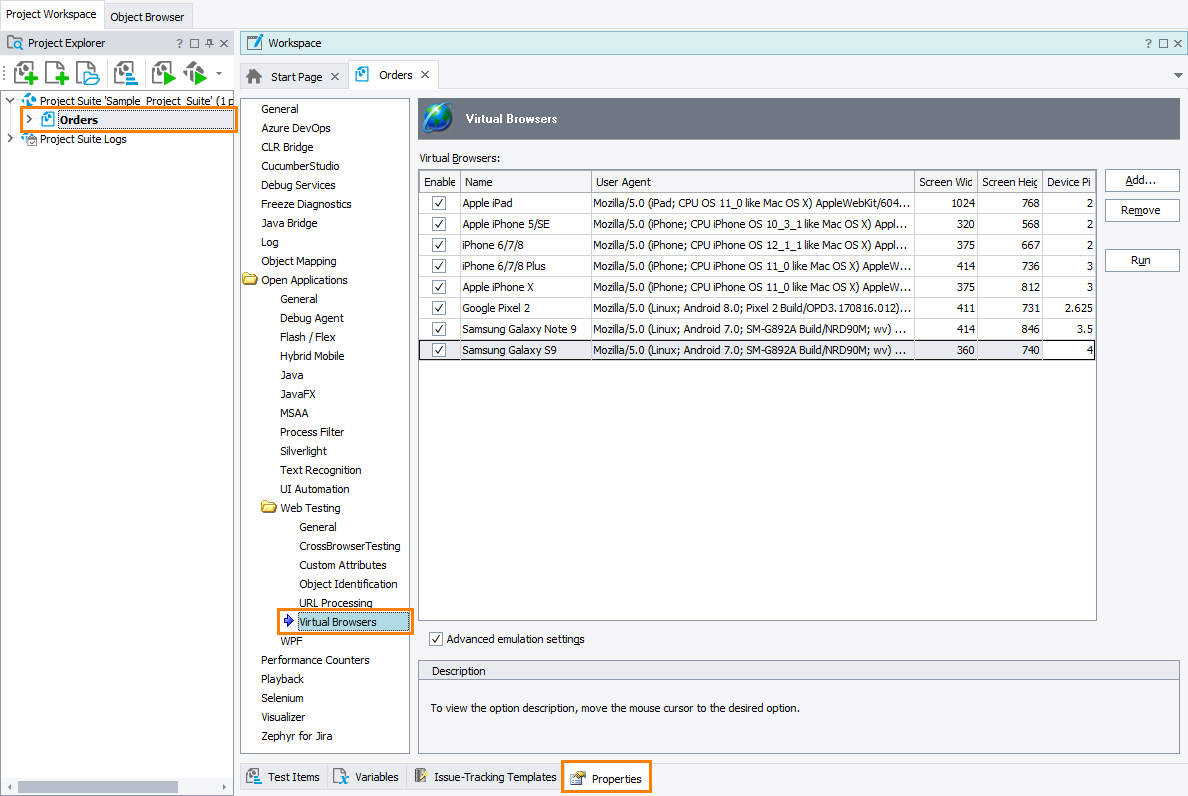
In the Open Applications > Web Testing > Virtual Browsers options, you can configure mobile browser profiles to be used in your test project.
To view or modify the Virtual Browsers options:
-
Select Tools > Current Project Properties from the TestComplete menu.
-
Select the Open Applications > Web Testing > Virtual Browsers category from the tree on the left.
You can change the following options:
-
Virtual Browsers - the mobile browser profiles that can be used in tests. They are listed in a table with the following columns:
Column Description Enabled Specifies whether the browser profile can be used in tests.
If unchecked, the browser profile is not included in the Run Virtual Browser and Virtual Browser Loop keyword test operations and in the
VirtualBrowsersscripting object.You can use this check box to change the set of browsers used by cross-browser mobile web tests without actually modifying the tests.
Note: Disabled browser profiles are still listed on the Recording toolbar and in the Tested Applications editor. If you select a disabled browser in the TestComplete UI, TestComplete will automatically enable it. Name The browser name that is used in tests. User Agent The browser’s user agent string. It identifies the browser and contains information about the browser version, operating system and its version, and specific browser enhancements. For example, iPhone 6 with iOS 9 has this user agent:
Mozilla/5.0 (iPhone; CPU iPhone OS 9_1 like Mac OS X) AppleWebKit/601.1.46 (KHTML, like Gecko) Version/9.0 Mobile/13B143 Safari/601.1When the browser emulator accesses a web site, it sends the user agent string to the web server that hosts the site. The server and the site can use this information to return browser-specific content.
You can find various mobile user agent strings here:
Screen Width
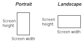
Screen HeightThe browser screen size in CSS pixels. Note that it is not necessarily the same as the device’s physical screen size. For example, iPhone 7 uses 2×2 physical pixels to show 1 CSS pixel, so the browser screen dimensions are half the physical screen dimensions.
You can find various mobile browser screen sizes on these sites:
Specify the screen width and height according to the desired default orientation - portrait or landscape.

Device Pixel Ratio Device pixel ratio (DPR) is the number of physical pixels per CSS pixels. For example, iPhone 7 has DPR=2, meaning it uses 2×2 physical pixels to show 1 CSS pixel. Web applications can use the device pixel ratio to conditionally load different CSS or images.
You can find DPR values for various devices here:
(Or, search for "device model device pixel ratio".)
To emulate the DPR, the Advanced emulation settings option must be enabled.
Use the Add and Remove buttons to add new browser profiles and remove unneeded ones.
To change the browser name or other parameters, enter the new values in the table.
To launch the mobile browser emulator with the selected profile, click Run.
-
Advanced emulation settings - Enabling this option activates additional emulation features:
- Touch event emulation - mouse events are translated into touch events like
touchstartortouchmove. - Device pixel ratio emulation using values from the Device Pixel Ratio column.
- Support for the meta viewport tag.
- Mobile scrollbar overlays - scrollbars that lay on top of the content, unlike traditional scrollbars that take their own space.
- Touch event emulation - mouse events are translated into touch events like
| Note: | Mobile browser emulation has some limitations. See Considerations for Mobile Web Testing Using Emulator. |
The default values for the Virtual Browsers options used in newly created TestComplete projects can be specified in Default Project Properties - Virtual Browsers Options.
See Also
Testing Mobile Web Applications Using Emulator
Creating Mobile Browser Profiles
Default Project Properties - Virtual Browsers Options
Project Properties


 Examples of web features affected by device pixel ratio