Mobile browser profiles to be used in tests are specified in the Open Applications | Web Testing | Virtual Browsers properties of a test project. TestComplete includes predefined emulation profiles for the browsers used in Apple iPhone and iPad, Samsung Nexus, Nokia Lumia and other devices. You can also create custom browser profiles for other devices and orientations:
-
To add a new mobile browser to a specific TestComplete project, open this project and select Tools | Current Project Properties from the TestComplete main menu.
-- or --
To add a new mobile browser to the default list (used in all new projects), select Tools | Default Project Properties from the TestComplete main menu.
-
Select the Open Applications | Web Testing | Virtual Browsers category.
-
Click Add.
-
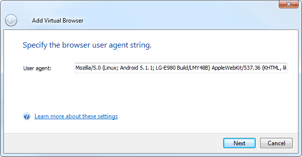
On the first page of the wizard, enter the browser’s user agent:

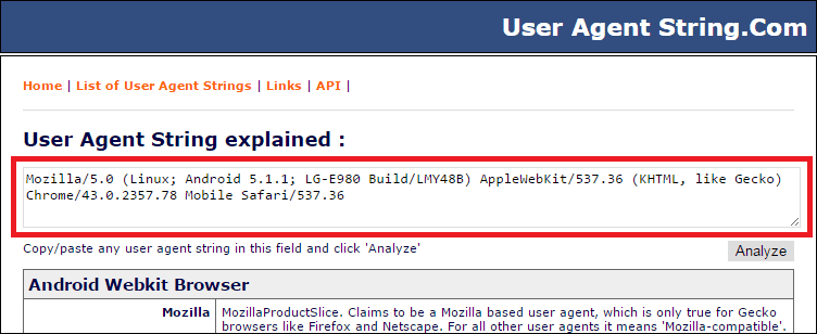
You can find various mobile user agent strings on these sites:
-
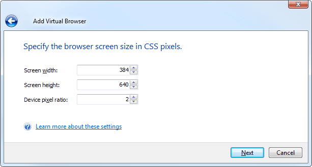
On the next page, enter the browser screen size in CSS pixels and device pixel ratio (ratio of physical pixels to CSS pixels). Note that CSS pixels are not the same as the device’s physical screen size. For example, Apple devices with Retina displays have double pixel density and use 2×2 physical pixels to show 1 CSS pixel. So, iPhone 5’s physical resolution is 1136×640, but its browser screen size is 568×320 CSS pixels.

You can find the values for your device on these sites:
Or if you have the device at hand, visit mydevice.io from the browser on the device:
Specify the browser screen size according to the needed orientation – portrait or landscape. For example, if the browser screen size is 384×640:
-
For portrait orientation, use Screen width = 384 and Screen height = 640.
-
For landscape orientation, use Screen width = 640 and Screen height = 384.
-
-
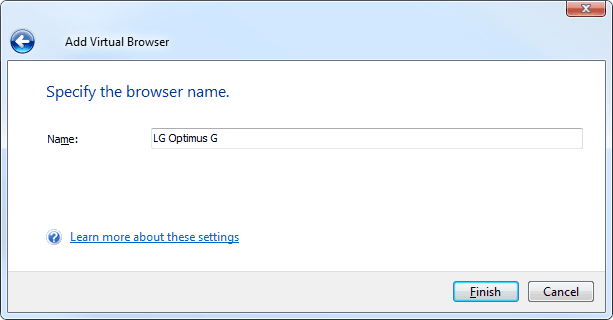
On the next page, enter the browser name that will be used in tests. It can be the same as the mobile device’s name. Examples: Kindle Fire HD, iPad landscape, Android 4.2 - Nexus 4.

-
Click Finish to close the wizard.
-
Save your project.
See Also
Testing Mobile Web Applications Using Emulator
Testing Mobile Web Applications Using Emulator - Overview
Creating Cross-Browser Mobile Web Tests Using Emulator
Specifying Additional Parameters for Mobile Browser Emulator


